Wednesday, January 9, 2013

A Look At The Sinister Side.


Saw the "Sinister Side of Pop" show at The Whitney recently.  I liked it more than the recent "Regarding Warhol" at the Met.  It just seemed more relevant to the sixties and early seventies.   Most of the artwork in it  touched on or represented critical issues of the era----and it certainly was a tumultuous time:  The Vietnam war, racial politics, women's liberation, the sexual revolution, political assassination, suburban sprawl, the rise of the so-called "highway culture," consumerism run amok-----these are issues addressed in the show.  Although I'm not the most political person, I sometimes consider  whether my paintings should address issues of today----i.e., global warming.  So, I was particularly interested in seeing how the artists represented in this exhibition managed to incorporate social/political/environmental commentary into their art, while still creating works that standup on purely aesthetic grounds.  (There were only three works in the show that felt less like art than like private scribblings.)

Allan D'Arcangelo's "Landscape," 1964, is a wonderful example of a painting that works on purely aesthetic grounds while commenting on the rise of the so-called "highway culture."  It conveys the uniformity of the interstate system taking shape in the sixties:  The nondescriptness of the roadway, surrounding land and roadblock convey the sense of anonymity that uniformity on a massive scale has.  D'Arcangelo's highway could be anywhere in the U.S.; and therefore, nowhere.  Thereby, the painting makes a statement about a loss of any sense of community, or place.  At the same time, he has abstracted the shapes of the highway and roadblock in a way that makes it clear that this painting is meant to be viewed purely as a work of art too.  Through the use of strong diagonal shapes coupled with flat color and simplified shapes, D'Arcangelo plays with the illusion of three-dimensionality versus the two-dimensioality of the canvas plane.  The effect is an amusing visual pun:  The viewer's eye is both stopped by the flatness of  the roadblock and other shapes, but led by strong diagonals down the highway, toward a vanishing point.
                          
Likewise, Bill Owens' photographs depict the uniformity of the suburban architecture.  His suburban houses and other structures have a prefabricated quality that is not site specific.  These buildings could exist anywhere in the United States, which makes them seem oddly insubstantial.  As a consequence, his photographs are disorienting----the viewer can't quite make out the locations shown.  The social landscape in these pictures has an absence of any real sense of community; therefore, they convey a mood of alienation. Owens photographs, as well as others in the show, reminded me of the Rod Sterling television series, "The Twilight Zone," with its science fiction fantasies that take place in some weird parallel universe.  (I'm not old enough to have seen the series when it first aired, but I did see it in syndication years later, when I was growing up.)

The uniformity and prefabricated qualities evident in Owens' suburban landscapes and D'Arcangelo's highway is also present in William Eggleston's print "Untitled,"1972 and Sturtevant's "Study for Rosenquist's Spaghetti and Grass,"1965-66.

William Eggleston, Untitled, 1972, from the "Troubled
Waters" portfolio, 1980.
The meat pies and ice cream in Eggleston's freezer are mass-produced items that will appear over and over again in similar freezers across the country.  Likewise, the spaghetti and tomato sauce in Sturtevant's picture look as if they came from a can:  It is preprocessed food.  (It looks as if it would be hazardous to eat the stuff, too!)  These meals were not homemade, they are devoid of an human touch----like so much else in a culture of mass production.

The commodification of the female body (or more specifically female sexuality) is suggested in both Tom Wesselmann's "Great American Nude, #57," 1964 and Rosalyn Drexler's "Love and Violence," 1965.   In Wesselmann's painting, a woman reclines----in a pose that made me think of Manet's "Olympia."  However, Wesselmann's nude woman has no facial features save for a lipsticked mouth----her personal identity seems to have been erased!  Her body has pronounced bikini lines too (which draw the viewer's eye to her breasts and groin).   The image is both impersonal and sexual at the same time:  Woman reduced to sexual plaything!  But, despite the disturbing details of the figure, the bold graphics and muted colors combine to make a very sensuous painting:  That makes the artist's message  seem ironical rather than angry.

Rosalyn Drexler's painting "Love and Violence," 1965 also employs handsome graphics in combination with disturbing images to make a statement about women and violence against women and the commodification of both.  According to the show's wall text, her images are drawn from pulp fiction covers and B-movie posters----and they look it!  The top of the painting depicts a woman being brutalized by a man, the lower part shows what looks to be a life and death struggle between two male figures.  That all the images are recognizably drawn from lowbrow entertainment, makes a pointed statement about the connection between violence, including sexual violence and mass culture.  The campiness of the graphics belies the violence of the images giving Drexler's painting an ironic twist.

Love and Violence, 1965.
The show also includes several works protesting the Vietnam war.  (I must admit that with the exception of Peter Saul's exuberant "Saigon," 1967, these pieces looked more like personal notes someone might tack to a bulletin board above their desk, than fully realized works of art.)  Saul's painting is quite jarring to look at initially----both stylistically and content wise.  The painting suggests a grotesque scene of rape and torture. All of which is rendered in an exuberantly cartoonish style in which the figures are distorted almost to the point of abstraction.  In day-glo colors no less!  His style, overall,  is quite grotesque looking----just perfect for his subject matter!  Saul has written on his painting:  "WHITE BOYS TORTURING AND RAPING... " and "HIGH CLASS VERSION."  The words are meant to be ironical, of course, but the implication is also that the war, or more accurately the media coverage of it, has become just an entertainment of sorts to the public; just something that one would watch complacently from the sidelines----and Saul's painting is protesting that, perhaps as much as the war itself.  (I always admire painters who have the courage to make art that flies in the face of conventional standards of good taste:  An ugly image can pack more visual punch than a "tasteful" one, but I would think it would be harder to win fans.)

Unlike The Met's recent "Regarding Warhol"show, this is no celebration of consumer culture!  The cool detachment seen in the earlier show is absent here.  In its place is art that is fully engaged, politically and socially!  This interesting show is credited to Donna De Salvo, Chief Curator and Deputy Director for Programs at The Whitney.  (The show runs through March 31.)

Wednesday, December 19, 2012

A look at the Metropolitan's George Bellows Retrospective.

It's important for an artist to keep abreast of cultural currents; in particular, events and movements in the art world:  Art isn't created in a vacuum after all!  And for my second blogpost ever, I thought I'd try my hand at reviewing!  I had planned to write about contemporary art in my maiden review, but I've been crazy busy lately, what with Christmas coming up.  So, I haven't been to any gallery shows lately.  I did, however, manage a visit to the Metropolitan's retrospective of George Bellows.  Wow!  It was really comprehensive:  It included his depictions of the poor and working class; urban life on the edges; construction projects----such as the preliminary groundwork for Penn Station; depictions of the affluent at leisure; seascapes he did on trips to Maine; World War I propaganda paintings; portraits----including family ones; and some late pastoral landscapes with an unexplained mystical bent.  I love his earlier paintings; his later ones, not so much.

I found Bellows' early paintings to be as fascinating as social commentary, as I did visually arresting.  (As a life-long New Yorker, I'm always interested in seeing visual portrayals of the city and its inhabitants, both current and historical.)   Bellows' are gritty portrayals of early-twentieth century New York and its lower classes.  They depict the squalor in which the city's poor lived and labored.  In "Cliff Dwellers," Bellows showed the overcrowding in tenements of the period.  "River Rats" and "Forty-Two Kids" depict poor boys at play on broken, dilapidated piers along the East River.  I liked that Bellows avoids sentimentalizing the urban poor, instead he shows his lower class boys for the crude, cocky beings they very likely were:  "Forty-Two Kids" shows one boy smoking, another urinating and yet others strutting or bent over, oblivious to the viewer.

Forty-Two Kids, 1907.
Cliff Dwellers, 1913.

Bellows' fame rests on his early paintings and it's not hard to see why.  His enthusiasm for his subject matter is evident in the sheer energy of the paintings, most notably "Stag At Sharkey's."

Stag at Sharkey's, 1907.
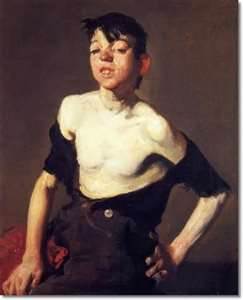
The painting's sharply contrasted lights and darks, it's limited palette and the artificial illumination of the boxers against a dark background hark back to Caravaggio, who used chiaroscuro to great theatrical effect.  (As a painter, I always try to discern what makes for a successful composition:  Having sharp contrasts in values tends to make for stronger images, as Bellows' most successful paintings demonstrate.)  Bellows' early portraits---such as, "Paddy Flannigan,"1908 and "Little Girl in White (Queenie Bernett)"----also use well illuminated figures against dark backgrounds.

Little Girl in White
(Queenie Bernett).

Paddy Flannigan, 1908.


As the show's text notes,  that puts them in a traditional mode of portraiture, whose practitioners include Velazquez, Frans Hals and Manet.  All of whose work he would have seen, according to the show's notes.  Despite the obvious influences, those paintings of Bellows don't feel derivative though.  The exuberance and sheer energy Bellows brought to them---as well as the bravura brushwork----make his paintings seem very much his own.  And, of his own time, too!

Also visually arresting are his depictions of the preliminary construction work on Penn Station.  "Pennsylvania Excavation," for one, depicts an enormous pit being dug for the station's foundations with the city's buildings portrayed as if they are at a distance----it's as if the excavation is taking place outside of the city----outside of civilization itself.  The site workers and equipment look puny in comparison----ant-like:  Little, black brush marks against a pale gray, gaping hole!  The pit almost seems to swallow them, like some sort of monstrous, primordial maw.  This, and Bellows' other portrayals of construction projects, emphasize New York's transitional, ever-changing aspect.  This city is no museum piece frozen in time:  Instead, it's a living, breathing behemoth!

Pennsylvania Excavation, 1909:  The excavation consumes the fore and middle
grounds, while the city itself appears at a distance.
When not portraying urban scenes, Bellows doesn't fair so well.  (The exception being his Maine seascapes.)  His paintings of upperclass life all look inert, they lack the flair of his urban work.  Even though some of these paintings depict sporting events (tennis matches, polo matches), which you might have thought would make for some really dynamic paintings, but apparently not.  In addition, despite a more colorful palette, the compositions look strangely flat, perhaps because they lack the stark contrast of light against dark that gave Bellows' earlier paintings real punch.

But that wasn't the worst of the show.  The worst was his propaganda paintings, which depict reputed atrocities in a way that look stilted and histrionic, to boot. (These paintings show German troops slaughtering Belgian civilians in WW I.)  That the atrocities shown turned out not to have occurred, turns the paintings into outright embarrassments.  As the show's accompanying  text points out, Bellows obviously had no personal observations to rely on for these paintings----in contrast to his other works, which could explain why they seem so stilted.

I was also taken with the Maine seascapes, or coastal paintings.  (Since many of these paintings are really closeups of rocks and waves----without a horizon line, perhaps "seascape" is a misnomer.)  Some, in the show, depict waves crashing against rocks as seen from the perspective of someone standing on an elevation.  The perspective is vertiginous, one false step or stumble and the scene's observer will fall headlong onto the rocks below!  That sense of danger adds a human element to the already turbulent scene of waves crashing against rock.

Churn and Break, 1913.
The paintings are reminiscent of late Winslow Homer's, as the show notes.  But even if Bellows borrowed from Homer, he clearly had an affinity for the subject matter, and he made it as much his own as his early urban paintings!

All in all, I thought the show was really interesting as much for revealing Bellows' weaknesses as a painter, as for showing his strengths:  The sheer physicality he brought to many of his early paintings----as evidenced in his bravura brushwork----was a plus, but his apparent inability to combine a range of colors with a strong contrast of values was a real weakness.  One senses from the show, that the young painter was incredibly confident, cocky even----just like some of the street urchins he painted, but that the more mature painter may have suffered through periods of self-doubt.  But then, don't we all!


Thursday, December 6, 2012

Welcome!


Since this is my maiden post, I want to introduce myself:  I am a New York City based artist.  And, a representational painter, who works primarily from life; although, I sometimes use photos as source material.  I sometimes paint the figure, but I am more interested in painting still lifes and landscapes/cityscapes.  My still lifes are usually painted from actual objects that have been setup in studio; my cityscapes/landscapes are usually painted on site, in venues in and around the city.

Also, I work exclusively with watercolor nowadays.  It has a translucent, luminous quality that is unique to the medium.  The transparency of the medium also suggests an ephemeral, transitional quality, which is one aspect of life that I wish to express in my paintings:  Both the actual passage of time and how an individual experiences time have always intrigued me!

It has always been my dream to become a professional artist.  And I have been working toward that goal for the past six years.  Although, I studied art extensively in my twenties/early thirties, I didn't think it was realistic----or practical----to try to become a professional artist then.  I do now!

The main purpose of this blog is to showcase my paintings and to mark my progress in transitioning from nonprofessional to professional artist:  Expect to see an occasional image of new work and my thoughts on my work.  Also, expect announcements of any upcoming exhibitions I participate in; or, any other milestone in my new career.

Also, I will use this blog to share my opinions on the current New York art scene:  Expect occasional reviews of gallery and museum shows----hopefully, my views will offer an entertaining  alternative to what is published elsewhere!


I am currently participating in the 4th annual "Small Works Show" at the Manhattan Borough President's office, 1 Centre Street, 19th Floor, New York City.  The show runs until the 30th of January.  Viewing hours are 9:30 to 4:30.  I hope you will find the time to go!

Below, my painting on exhibition there.
Concert Grounds With Seated Figure, Central Park, 2011,
10"x14," Watercolor On Paper.  Copyrights reserved to
Margaret Montgomery (c) 2012.


I am also, participating in The Art Students' League annual Christmas Show.  Now, 'til the 23rd of December.  215 West 57th Street, New York City.

Young Woman In A Blue Dress, 2010, 16"x12," 
Watercolor On Paper.  Copyrights reserved
to Margaret Montgomery (c) 2012.homeVisit my website to see an online gallery of my work!