Tuesday, December 3, 2013

I'm Back!

Late Summer Fugue, 2013, 12"x16," watercolor on paper.   All
copyrights reserved to the artist.  (c) 2013.
I hope no one has given up on my blog.  I know I've been remiss in not posting anything for awhile, but I intend to begin doing so on a regular basis again.  My hiatus was due in part to the unusually mild weather this fall.  I couldn't resist the opportunity to continue doing the plein air painting I began in the summer.  There is something really special about the experience of painting in situ, a sort of sense of discovery.  You gain a heightened awareness of all aspects of a particular place:  Its physical dimensions; how it looks in different light conditions; you observe who uses the space and how.  But now that the weather has turned cold I intend to start going to museum and gallery exhibitions once again.  I'm already really excited about some of this winter's shows!  In particular, the "Masterpieces of Dutch Painting" at the Frick and the Magritte show at the Modern.  I only hope you will once again tune in to read my posts!  In the meantime, here is a sampling of my plein air work from this summer and fall:
Central Park Footbridge in Autumn, 2013, 14"x20," watercolor on paper.
(c) 2013.
Central Park Footbridge, Overcast Afternoon, 2013, 10"x14," watercolor on paper.
(c) 2013.

These three are all the same bridge in Central Park.  I was drawn to its shape; there is something compelling about the tension created by the repetitiveness of the multiple arcs.  They form a visual vortex that pulls the eye in and directs it to the view beyond.  It is also fun to observe how differing times of year and weather altered everything.

In addition to doing multiple takes on a footbridge, I did a series of city park fountains.  In the process I became much more familiar with many of the city's parks than I had been before.  The ones below are, respectively, on the lower east side of Manhattan and just east of Chelsea.
  
Stuyvesant Square Park Fountain, 2013, 14"x10,"
watercolor.  (c) 2013.
Madison Square Garden Park, 2013, 10"x14," watercolor.  (c) 2013. 

I also painted some street views.  Below, a scene on the lower west side of NYC:
Staple Street, 2013, 14"x10," watercolor.
(c) 2013.
Staple Street is a wonderfully quiet oasis in a spectacularly noisy city.  It is a teeny side street, just off of Duane, which is pretty quiet to begin with.  The paintings I did there were probably the most successful street views I did this summer or fall, which I attribute to the tranquility of the place.  All the other ones I tried were in the midst of a fair amount of traffic, both foot and vehicular.  While I credit myself with superior powers of concentration, I nevertheless found it too distracting to achieve anything worthwhile.

 Also, fun was to paint sites that I'd done in the past, and then compare the results.  Below, two takes on the Bethesda fountain in Central Park----done two years apart:        
Balustrade & Bethesda Fountain, 2013,
10"x10," watercolor.  (c) 2013.
Balustrade & Bethesda Fountain, 2011, 9"x12," watercolor.
(c) 2011.


By the by, The newer version is in the "Small Works Exhibition" from December 4 - January 12 at the Manhattan Borough President's office, 1 Centre Street, 19th Floor, NYC  10007.  And, the older version will be on sale ($200.00) in the Art Students League's annual holiday exhibition, which runs from December 6 to the 22nd.  Art Students League, 215 West 57th Street, NYC  10019.

Monday, September 16, 2013

Light And Perception: James Turrell's Light Installations At The Guggenheim.

A rendering of James Turrell's Aten Reign installation at the Guggenheim.
For an unique experience, try to see the James Turrell exhibition at the Gugggenheim before it closes (September 25).  Usually, I'm not a big fan of light sculpture, but I was bowled over by this show.  But then, what Turrell does isn't really sculpture----at least not in the conventional sense.  Rather his installations are immersive and transformative experiences that challenge the viewers notions of perception; particularly in terms of perspective and tangibility:  In some of his installations he makes light itself appear to be a solid object by using apertures to project it in relative darkness.  Turrell has a degree in perceptual psychology and his installations seem as much sensory experiments as works of art.  They make the viewer aware that what they think they see isn't necessarily so.  His artwork calls to mind Plato's Allegory of the Cave, in which cave dwellers' perceived reality is merely shadows on a wall.  And, after having been immersed in this exhibition it's hard not to wonder about one's own grip on reality----is what one sees actual, or just shadowy illusion?

Prado, 1967.  In this installation light
is projected through an aperture onto
an otherwise unlit wall.
Turrell was in the forefront of the light and space movement that began during the sixties in California. One suspects that his interest in perceptual phenomena may have been influenced by the aesthetics of the era's psychedelic drug culture as well; even if he didn't use hallucinogenics himself----there is something decidedly trippy about his work; although, the exhibition catalog cites only his Quaker upbringing and background in perceptual psychology as determining influences:  Turrell has said that he wanted to recreate the meditative and participatory environment of Quaker prayer meetings in his installations.  I didn't find Turrell's installations to be particularly conducive to meditation, but they certainly are participatory:  They are more than just lights, they are also manufactured environments that encompass the viewer, forcing one's senses to become fully engaged.  As Turrell has said, his installations are as much about the act of perceiving as they are about what is perceived.  Particularly since what that is, isn't always so clear.

If you go to the Guggenheim, the first installation you'll come upon is Aten Reign.  The museum's rotunda has been transformed by it:  The usual open, airy architecture replaced by a series of concentric cones that both make the space smaller and saturate the viewer in an intense color that slowly moves across a full spectrum, ranging from red to blue, and back again.  The piece has been described as a skyscape.  I suppose it is, but not like any I've ever seen.  The intense color seems too alien, extraterrestrial even:  I imagine it is what the atmosphere might be like on a planet much closer to its sun, than ours is to ours.
A view of the site specific installation:
Aten Reign.


Aten Reign is also about sensory deprivation though.  While the light changes color, it is of an uniform intensity that numbs the senses, making it hard to fully understand the area's physical dimensions.  (The sensation was disorienting.)  As an undergrad, Turrell studied something called the "Ganzfeld effect."  It is a perceptual phenomena resulting from uniform and unstructured stimulation; as much about loss of vision as it is about seeing.  Aten Reign's successive colors also create distinct after images, adding to the sensory confusion.  Iltar is another installation that uses sensory deprivation.  It consists of a dark, indistinct room with what looks like a dark rectangular screen illuminated by the faintest of light projected onto the two opposite walls.  One optical effect is that the lights start to seem as if they are pulsating; another, the rectangle seems to grow darker.

I have to admit, I was a touch disappointed with Iltar.  There was quite a wait before I could see it.  The installation setting consists of a small room, and only two or three viewers are allowed in at a time.  One result was heightened expectations that weren't quite met.  Still, it was an interesting experience.  My favorite installations though are Afrum and Prado both 1967, and Ronin 1968.

Afrum, 1967.  This is a cross-corner
projection.
Turrell has said that he wants to treat light as material, not just as a source of illumination.  And his piece Afrum succeeds sensationally at that.  It is a cross-corner projection, consisting of two apertures each beaming light onto an adjoining wall.  If you see it, you'll think at first that it is a three-dimensional object suspended in a corner.  Although, it also seems to change shape as the viewer moves around the room; it seemingly shifts from cube to rectangle to trapezoidal shape.  Only by walking up to the corner, does it becomes apparent that there is nothing solid there; instead, only light projected onto the walls.  Unlike Afrum, Prado and Ronin each consist of only one aperture from which light is beamed.  But, like Afrum, Prado and Ronin appear tangible, like something tactile.  Ronin appears as a separate plane, slightly apart, seemingly angled away from the wall plane upon which it is projected.  Whereas, Prado looks like a light filled doorway, you almost think you could walk through it.  It is only up close that the illusions becomes apparent.

Ronin, 1968.
I can't emphasize enough how special this show is; or the extent to which it changed how I think of both light and sensory perception.  It made me more aware that light can be experienced as not only a source of illumination for physical objects, that it can transform itself into an apparent thing in its own right.  Or, transform an environment into something quite alien----and otherworldly.  And, if I didn't often question the veracity of my senses prior to this show, I will now!

Guggenheim Museum, 1071 Fifth Avenue (@89th Street), NYC.  Unfortunately the show ends on the 25th of September.


Friday, August 16, 2013

Civil War and American Art At The Metropolitan Museum.

Frederic Edwin Church, Cotopaxi, 1862.
I recently went to the Met's Civil War exhibition.  While there are many figure and genre paintings, the emphasis is on landscape, which I suppose isn't surprising given the popularity of landscape painting during the first half of the nineteenth century.  (As a landscape painter myself, I always take a special interest in seeing how the subject matter has been handled through the ages.)  What is surprising though is the inclusion of many
Sanford Robinson Gifford, A Coming Storm, 1863.
landscapes with no apparent relevance to the war.  But, it is the controversial thesis of this exhibition catalog (written by Eleanor Jones Harvey)* that they should be interpreted as allegories for the political and social strife of those years; and, therefore, be considered as much about it as the paintings depicting the battlefront.  That is a thesis that I don't entirely buy----with the sole exception of Frederic Church's "Our Banner in the Sky," I think it's too big a stretch.  Although, the political and social strife surrounding the war certainly did influence the general outlook of painters such as Church, as can be seen in his foreboding and portentous landscapes of the era.  Church's "Cotopaxi," 1862 is an example.  A dramatic rendering of the violent and destructive side of nature:  It depicts an Ecuadorian volcano erupting.  Still, I don't buy the notion that these paintings should be interpreted as allegories for the war.  Note that landscape painters had portrayed nature at its most violent long before, and continued to do so long after.
John Frederick Kensett, Paradise Rocks, Newport, 1868.

In addition to Church,  the works of Albert Bierstadt, Sanford Gifford and John Frederick Kensett are on exhibit.  All were part of an American nineteenth century art movement known as the Hudson River school.  The country's dominant movement of the time, the Hudson River school promulgated a highly idealized take on the American wilderness.  During the first half of the nineteenth century its adherents created a transcendental vision of the wilderness, which conceptually, approximated the philosophies of such contemporaneous thinkers as Ralph Waldo Emerson; who held that God could be intuitively experienced through a meditation on nature.  The Hudson River school artists imputed spiritual and regenerative influences to the wilderness too.  The eighteenth century notion of nature as background to a larger, human drama, gave way to paintings in which the landscape took center stage.  Nineteenth century painters tended toward the  animistic in their view of nature; their landscapes are emotive and heavy on atmospherics:  The Hudson River school painters meant theirs to be nothing short of transcendental visions.**    Favorite subjects were mountains, symbolizing a heavenward ascent, and luminous golden light, symbolizing Divine Grace.  (As someone who was a philosophy major, I've always taken an interest in the ideas----particularly metaphysical ideas----that inform art movements and find expression in their adherents' paintings.)


Sanford Gifford, The Camp of the Seventh Regiment near
Frederick, Maryland,1863.
Most of the artists who recorded the war, were primarily landscape painters by training and inclination, and they brought that sensibility with them.  As can be seen in such works as Sanford Gifford's The Camp of the Seventh Regiment near Frederick, Maryland, 1863 and Albert Bierstadt's Guerrilla Warfare, Civil War, 1862.  Both are basically landscape paintings that happen to include the figures of soldiers in them.  There may be an army encampment in Gifford's painting, for example, but the emphasis is on
Albert Bierstadt, Guerilla Warfare, 1862.
the panorama of field, distant hills and the sun breaking through clouds.   Not on the human drama.  Also, notably absent are any scenes of actual combat.  The closest thing are depictions of soldiers aiming rifles, as seen in Albert Bierstadt's Guerilla Warfare.  Since many of the paintings were done on site or from studies that had been, there were logistical reasons for not depicting pitched battle, of course.  But still, one might have expected more of an emphasis on the human conflict.

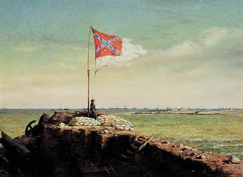
Conrad Wise Chapman, The Flag of Fort Sumter, Oct. 20 1863.
The Confederate side is represented by a sole artist in the exhibition:  Conrad Wise Chapman.  According to the show catalog, part of an ex-patriot family living in Rome, Chapman enlisted with the Confederate army.  After being wounded, he was commissioned to do a series of paintings depicting the fortifications surrounding Charleston's harbor.  Like  Gifford (who was enlisted on the Union side), Chapman is more landscape, than history or genre painter.  His portrayals of Fort Sumter, for example, rely as much as anything on the changing light conditions to convey emotion.  As in Gifford's and Bierstadt's war paintings, his human figures seem almost incidental to their surroundings.  All of which isn't to say that his and Gifford's paintings aren't moving testaments, they are.  Indeed, I wish I could paint such expressive skies!  Although, I have no interest in adopting a romantic aesthetic.  (I am a realist painter and I'm not about to change my basic philosophical bent!)

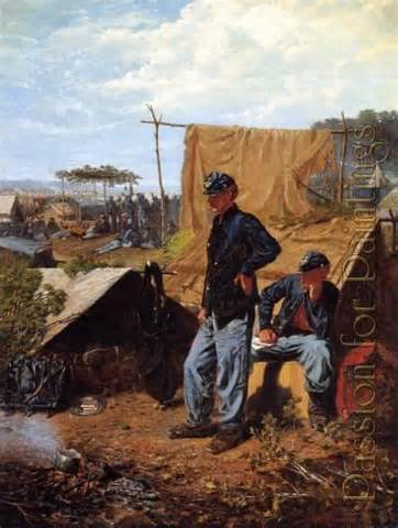
Winslow Homer, Home, Sweet Home, 1863.
Of course the war had a profound and broad influence on artists of the time---no one would argue against that!  And, therefore, as is noted in the accompanying wall text, the exhibition is as much a record of its cultural impact on artists of the time as it is a record of actual events.  And the personal impact on artists can be seen in direct proportion to how much exposure each had (or didn't have) to the battlefront.  Of the landscape painters on exhibit, only Chapman and Gifford were actually enlisted.  And only Chapman had any exposure to battle.  In contrast, Winslow Homer----one of the few non-landscape painters in the show----saw the war up close for prolonged periods while embedded with Union troops at the front.  He did so in the capacity of artist/correspondent for Harper's Weekly.  And unlike the landscape painters, Homer's focus was squarely on the human drama.  Although, like the landscape painters he did not portray actual combat:  The closest he came was 'Skirmish in the Wilderness," 1864, which like Bierstadt's "Guerilla Warfare," shows Union soldiers pointing rifles at an unseen enemy.  But unlike the landscape painters, Homer's scenes of soldiers in camp actually focus on the human drama, showing the personal toll of war.   "Home, Sweet Home," for example, shows two soldiers whose postures and sidewise gazes give them a war weary and preoccupied air.  One has a letter, presumably from home.

Winslow Homer, A Visit from the Old Mistress, 1876.
Also, as can be seen in some of his paintings dealing with the aftermath of the war, Homer clearly took a genuine interest in the political and social issues in the aftermath of the conflict----something that Gifford, Bierstadt and the other landscape artists didn't----or at least not in their paintings!  Homer's "A Visit From the Old Mistress," for example, suggests the difficult social relations that lay ahead for blacks and whites.  It shows newly emancipated slaves being confronted by their former mistress, who must now bargain for their labor.  The tension between them is palpable.  Homer isn't the only genre
Eastman Johnson, Negro Life at the South, 1859.
painter in the exhibition.  Also of notable interest are works by Eastman Johnson.  Like Homer, Johnson took an interest in social issues such as race relations in the South.  His "Negro Life at the South, 1859 is one of the more interesting, if ambiguous paintings on exhibit.  It depicts slaves of varying skin colors in their quarters, next to the master's house.  While there is some ambiguity about the scene, that some slaves were sexually imposed upon by the master is pretty clear.

One of the things I found most fascinating about the exhibition was the disparity between what was being produced by the landscape painters on view, all of whom share a basic romantic aesthetic vision, and their realist counterparts----most notably Winslow Homer and Eastman Johnson.  It is hard not to conclude that the transcendental beliefs of the Hudson River school were ill suited to the portrayal of a manmade catastrophe such as the Civil War; or to addressing the difficult social issues in its wake.  So it isn't surprising that their paintings fell out of favor over the next two decades.

Notes:
*Exhibition Catalog:  Civil War and American Art by Eleanor Jones Harvey.  Smithsonian American Art Museum in association with Yale University Press.  (You can peruse copies of the catalog at the exhibition, as I did.)

**Knights of the Bush:  The Hudson River School and the Moral Landscape.  James F. Cooper.  Copyright 1999, the Newton Cropsey Foundation.  Published by Hudson Hills Press, Inc.

The Civil War and American Art runs through September 2, 2013.  Metropolitan Museum of Art, 1000 Fifth Avenue, NYC.


Wednesday, July 3, 2013

I'm Having My First Ever Solo Exhibition! And Everyone Is Invited!

As I mentioned in my maiden post, one of my purposes in keeping a blog is to record my progress transitioning from amateur artist to professional.  Later this month I achieve a major milestone with the opening of my first solo exhibition to date.  (I have participated in many group shows in the past, but this is a first!)  I will have eight watercolors on view from July 15 to August 10 at Berlitz Language Center, located at Rockefeller Center.  (Rockefeller Center!  Cool huh?)  While Berlitz may not be an actual art gallery, it is a great location; and it is open to the public; and everything in the show will be for sale too!  Eventually (like every artist) I hope to have gallery representation, but it is my understanding that galleries won't take you seriously unless you've had at least some solo shows already.  I have planned everything out quite thoroughly, so I don't expect any glitches; nevertheless, this will probably prove a useful learning experience.  (Hopefully, not too much of one, though.)

My exhibition has a theme, it is fresh produce.  Hence the show's title, Fresh Produce:  Eight Still Lifes (See the invitation, below).  I think it is useful, as an organizing principle, to have a  theme.  It gives a show added interest and more cohesion than it would otherwise have.  Additionally, it is my understanding that classes at the Berlitz Language Center make use of any art exhibited there to practice  conversational skills.  (A notion that I find quite amusing!)  And, I think a thematic art show might lend itself more easily to discussion.


       __________________________________________________________________________


My primary intention in focusing on perishable fruits and vegetables is to emphasize the temporal, though.  No matter what state I capture the produce in, it is only a phase:  A moment in time!  I think the short life cycle of produce, in all its manifestations, makes it the best metaphor for life's ephemeral, transitional nature.

For the most part, I am a realist----I believe everything is contextually dependent.  That is to say, everything is determined by its environment (context).  And, I try to suggest my philosophical bent in my artwork.  I do that, in part, through my matter of fact painting style, but mainly, I express it through my emphasis on the composition as a whole:  No single object is allowed to dominate the paintings; instead the placement and spatial relationship between them is given precedence. 

The still lifes in the exhibition have all been carefully staged; a certain amount of thought went into deciding which elements should be included in the compositions, and where they should be placed in relation to each other.  Yet, I intentionally avoided making them look that way.  Instead I tried to convey a certain arbitrary, non-idealistic quality.  I also juxtaposed items that are not necessarily related as a comment on life's seemingly chaotic aspect (regardless of one's best efforts, the ability to fully control circumstances is always beyond reach!)

My show will be at Berlitz Language Center/Rockefeller Center, 40 West 51st Street, Sidewalk Level, NYC.  Opening July 15, it runs through August 10.  Viewing hours:  Mon - Fri  9:00am - 7:00pm; Sat & Sun  9:00am - 2:30pm.


Monday, June 3, 2013

The Brooklyn Museum's John Singer Sargent Watercolor Exhibition.

I recently went to the Brooklyn Museum's John Singer Sargent watercolor exhibition.  My reaction?  Wow!  It is truly awe inspiring, both in terms of its scope and quality.  A real must for anyone who is serious about watercolor painting.  As I am!  The paintings are from the museum's vast holdings of Sargent and from the Boston Museum of Fine Art's, too.  Sargent sold the respective collections to them himself;  apparently, believing the paintings should stay together and be viewed that way.  He reportedly considered his painting processes of particular significance; and the emphasis of this show is on just that.  There are videos throughout demonstrating how Sargent's paintings were composed and executed; plus, an analysis of his palette based on infrared imaging.  The wall text throughout the show describes not only the materials used, but the differing methods employed to create various effects including highlights:  From painting wet on wet to using dry brush; from scraping and lifting paint to adding white gouache.  As a watercolor painter myself, I found the exposition to be genuinely educaional.  In particular, I was surprised that Sargent was able to get such a broad spectrum of colors using a palette of only seven colors!  Also, I was surprised by his frequent use of white gouache and that it didn't compromise the luminous, transparent quality that is so special to watercolor.  (Really, if you want to, you can learn a lot about watercolor technique from this show!)
In a Medici Villa, 1906.

While the paintings here encompass a broad range of places and topics, Sargent's techniques and virtuoso brushwork are a constant; as is his interest in the optical effects of bright sunshine----as the show's accompanying wall text notes.  The refracted light on water; the glare of sunshine on stone or stucco, light filtered through leaves or sailcloth----that is the real subject of his paintings, not the harbors, streams or architectural elements that make up his compositions.  "In a Medici Villa" is a good example:  The focus is on the optical effect of intense sunlight on the fountain's basins while the statuary has been left undefined and the statues atop have been omitted from the composition altogether.  The show's accompanying text also notes Sargent's tendency to present only a partial view of his ostensible subjects; noting that his watercolors present a view of things as one might visually experience them in real life, rather than trying to replicate entire buildings, fountains, gardens, etc. in detail:  Like the Impressionists', his compositions show the influence photography had on artists.

Santa Maria della Salute, 1904.
In terms of perspective, I think Sargent's most inventive and fun compositions are of the canals and waterside architecture of Venice.  He reportedly painted many of those scenes while being ferried around in a gondola.  Its prow is visible in the foreground of some of the compositions, such as "Santa Maria della Salute;" here, as elsewhere,  the prow establishes the painter's viewpoint and leads the viewer's eye into the picture:  The seemingly random angle of the gondola and its loose brushwork give an otherwise formal architectural rendering a playfully spontaneous twist.  One of the most striking aspects of Sargent's watercolors is the distinct sense one gets of where the artist was in relation to his subject matter:  When you look at "Santa Maria della Salute" you know Sargent was sitting in that gondola.  In paintings where the perspective doesn't quite align, such as in some renderings of fountains, you get the sense that he simultaneously looked up and down while standing in place, creating sort of a double-take on the scene.  (If You scrutinize "In a Medici Villa," for example, you'll realize that it would be impossible to see the fountain's two upper basins and its lower one without shifting one's gaze----up and down.)

White Ships, circa 1908.
The Impressionists were already creating compositions with more naturalistic perspective, and Sargent did see and was influenced by their paintings.  Indeed, he was supposedly friends with Monet.  Like the Impressionists, Sargent wasn't interested in literal or descriptive renderings, but rather in capturing a sensation of phenomena as it might be experienced by someone casually coming upon it.  Along with Impressionism, Sargent's watercolors show the influence photography had on artists of the day.  Like the Impressionists, Sargent jettisoned the traditions of landscape composition in favor of seemingly spontaneous "snapshots" of outdoor scenes with sometimes unexpected perspectives.  That aspect of Sargent's compositions make him as distinctly modern an artist as any of the Impressionists, even if he was never truly in the avant-garde.  (Personally, I prefer Sargent's brushwork to theirs.  I like the greater variation, from flat washes to single brushstrokes and thin transparencies to thick impasto dabs and splatters.  I don't think the paintings would seem so alive or spontaneous without the variation.)

It has been pointed out by various Sargent critics that many of his paintings strike a distinctly Romantic note with the frequent depiction of Renaissance architectural elements, including buildings, courtyards gardens, fountains and statuary.  It has been suggested that Sargent viewed the Renaissance as representing an artistic and cultural ideal.  That his Renaissance motifs express a nostalgia for some bygone (idyllic) era.  Unfortunately, from a contemporary sensibility much of the statuary depicted in Sargent's paintings seem more campy and kitsch than ideal (as do the originals).  I suspect Sargent may have viewed them----based as they are on mythological subject matter----as inspirational and uplifting.  Instead, they seem schmaltzy.  The sentimental Romanticism of those paintings make Sargent seem somewhat anachronistic, at variance with the dominant artistic movements of his time.  Not only the Cubism and whatever of the early twentieth century, but even out of step with the earlier Impressionist movement as well.

Additionally, the Romanticism seems incongruous with Sargent's own watercolor painting style.  The informality of the compositions; the perfunctory treatment of figures:  Sargent's background/mid-ground figures are barely more than a brushstroke or two, if that; his foreground figures are painted in the same cursory brushwork as their surroundings.  Stylistically he was as much a Realist as the Impressionists.  And it can be argued----and this exhibition goes along way toward making the case----Sargent's only real subject matter is sunlight:  With all the brilliant optical effects that can occur when natural light is refracted on everything from fabric, stone, water and leaves.  And I don't think any painter has ever captured the dazzling effect of sunlight quite like Sargent, whether it is dancing across water and reflected on a ship prow or fountain basin, or illuminating the surface of buildings, courtyards, colonnades or, yes, statuary.

The show continues until July 28, Brooklyn Museum, 200 Eastern Parkway, Brooklyn. 

Wednesday, May 8, 2013

Tibor De Nagy Gallery's Jane Freilicher Show, "A Painter Among Poets."

Painter in the Studio, 1987.


I recently went to the Tibor De Nagy Gallery's "A Painter Among Poets" show.  The emphasis is on the  friendship between Jane Freilicher and a group of poets, which included Frank O'Hara and John Ashbery, and the influence they had on her work and vice versa.  Initially, the show's theme seemed kind of gimmicky to me, but after thinking about it awhile I decided that it added to my appreciation of Freilicher.  There is often a correlation between an era's written and visual arts, after all:  A shared world view and artistic sensibilities.  So, knowing what literary ideas an artist was exposed to can certainly enhance one's understanding of their artwork.  After blowing the dust off an old American literature anthology, and rereading O'Hara's and Ashbery's respective poetry it is apparent to me that they and Freilicher do indeed have a certain shared sensibility.  (Unfortunately, I have no familiarity with the other poets in her circle and therefore no way of gauging whether or not the same holds true for them----I couldn't find any examples of their poems in my meagre library, either.)

As to Freilicher, O'Hara and Ashbery, there is an informality to all their work.  Freilicher's paintings have a seemingly accidental quality, as if a scene had just been happened upon.  Her friends' respective poetry has a similarly casual, incidental quality.   Freilicher's paintings seem intimate, personal. They present  the sights and things of everyday as they might be casually glanced:  The views from Freilicher's windows in New York and out on Long Island; flowers and personal nicknacks----all recurring motifs in her work.  All presented in informal compositions that can have an awkward quality; sometimes planes don't quite align, foregrounds are viewed from above, backgrounds from eye level; even within planes the perspective isn't always consistent, shifting from different angles.  This gives the paintings a slightly random and dissolute quality, like something only partially, or quickly, glanced.  In some, particularly those that combine a still life with a landscape or cityscape viewed through a window, the motifs are incongruously juxtaposed, imbuing them with a surreal aspect.  Likewise, O'Hara's and Ashbery's respective poetry presents the mundane stuff of personal experience in all its incongruity.

Parts of a world, 1987.
The show includes several examples of Freilicher's juxtapositions of interior and exterior views. Combining the two is a recurring compositional device for her, enabling her to juxtapose incongruous surreal elements, such as can be seen in "Parts of the World," 1987 or "Crosstown View, 1978.  In both, a table laden with objects appears in the foreground, in front of a window view of a cityscape.  Thus allowing Freilicher to play with scale.  She is able to present the personal and intimate as monumental, dwarfing the city's skyscrapers.  There is something particularly fun and theatrical about her still lifes.  Viewed in closeup against the city skyline, they have a Magritte apple-in-the-sky aspect without actually departing from the laws of gravity.

There are also several landscapes here that show the influence of abstract expressionism, such as her "Cover Crop," 1963, which has gestural flourishes that are reminiscent of some of de Kooning's work.  But in Freilicher's paintings the gestural figurations seem merely dreamy and atmospheric.  Her most abstracted paintings in the show, "Henry Ford's Dunes,"1961 and "Abstract Landscape," 1963 seem more ethereal and mirage-like than nonrepresentational:  As if the view had been obscured by a dense fog.

In addition to Freilicher's paintings, including portraits of the poets and some poems they wrote about her, the gallery also presents postcards and other scribblings she and her friends wrote to each other.  Personally, I thought there was too much of that in the show.  Much of it had the feel of inside jokes----"you-had-to-have-been- there..." kind of humor.  Although that stuff did mirror the general informality and humorousness of Freilicher's paintings, it seemed unnecessary.

One thing that is obvious from the show although it isn't actually mentioned, is that Freilicher and poets O'Hara and Ashbery focused on the personal and everyday to the exclusion of the political and social issues of their day; unlike the more cutting edge artists and writers of the sixties and on.  That makes their respective work seem somewhat insular at times.  But what consistently comes across is a light-hearted, genuine joie de vivre.  And, an appreciation for the absurdities of everyday life.  If you see the show, Freilicher's paintings will surely leave you smiling.

The show is at the Tibor de Nagy Gallery, 724 Fifth Avenue, NY, NY.  It continues until June 14.


Tuesday, April 9, 2013

The Gagosian Gallery Puts On A Frankenthaler Show To Rival Any Museum's.

In recent years, the Gagosian Gallery has had the occasional comprehensive exhibition of an important artist that rivals that of any museum's.  "Painted on 21st Street:  Helen Frankenthaler from 1950 to 1959" is one such show.  Indeed it is curated by the Museum of Modern Art's Chief Curator Emeritus of Painting and Sculpture, John Elderfield, with the aid of the Frankenthaler estate:  All the paintings are on loan either from the Helen Frankenthaler Foundation or institutions such as museums.  I don't like to sound cynical, but I presume the purpose of putting on such events is really to enhance the gallery's sales ability by trying to establish a reputation as venerable cultural institution, as much as commercial enterprise.  Don't get me wrong, I'm not complaining!  The opportunity to see great art is always welcome, particularly if the viewing is free!
Mountains and Sea, 1952.


The Gagosian even has a museum quality catalog put together with an intro by Elderfield.  At a hundred bucks, it's too expensive for me, but the gallery makes a copy available to peruse (which I took full advantage of).  Elderfield  points out that while these paintings aren't descriptive they are nevertheless depicitive.  In other words, although they are non-representational, non-narrative they are still figurative.  He also points out that the mind tends to interpret forms as positive objects and the surrounding area as background.  Also, According to him, Frankenthaler drew inspiration from landscapes, which is certainly suggested by some of the titles:   i.e., Abstract Landscape, 1951; Mountains and Sea, 1952; Ed Winston's Tropical Garden, 1957.  It is also suggested by compositional elements, such as low and mid-level dominant horizontal lines or shapes that tend to divide the compositions into foreground, mid-ground and/or far-ground.  Although, with their amorphous, and seemingly primal forms, Frankenthaler's paintings seem more like  landscapes of the mind, or dreamscapes, than anything tangible.
Eden, 1956.


Like first generation abstract expressionists, Pollack, Gorky and de Kooning, Frankenthaler was perhaps influenced by Jungian notions of archetypes and the collective unconscious; also, by surrealist automatism.  That is suggested by Frankenthaler's occasional use of titles that reference mythology (i.e., Eden; Jacob's Ladder; Europa).  And by her amorphous forms, which in aggregate give the impression of some sort of primordial soup.  While the forms are ambiguous, they tend to be suggestive enough to be associative images.  In Eden, for example, in the upper left corner the amorphous yellow form is somewhat suggestive of a child's painting of a sun; upper right-of-center a red form is suggestive of a reaching hand.  But, because the forms are all ambiguous the overall impression is of a free-flowing associative process.  Sort of like how the mind functions, which gives the paintings, or the act of viewing them, a mimetic aspect.

While the artwork in this show predates Frankenthaler's innovations in color field painting, her interest in color is very apparent here.  Indeed, Elderfield describes Mountains and Sea as a bridge between her abstract expressionist paintings and color field ones.  And, the colors tend toward the organic:  Beiges, browns, pale pinks and ochers dominate with an occasional blue that tends to read as sky, sea or shadow.  In addition to being gorgeous to look at, the muted colors appear much the way colors do to the mind's eye.  As a result, Frankenthaler's palette conjures a mental landscape,consisting of random images and/or thoughts.  So, the color contributes to the paintings' mimetic quality.

Seeing this show was a reminder that abstract art is never content free.   (Show me contentless "art" and I'll show you wallpaper!)  Many of the abstract expressionists found their subject matter by looking inward to find a commonality or the archetypal in our "collective unconscious"----Frankenthaler appears to have done so.

The show is at the Gagosian Gallery, 522 West 21st Street, NY, NY.  Unfortunately, it only runs through the 13th.